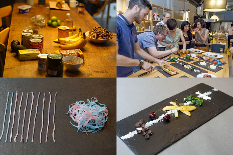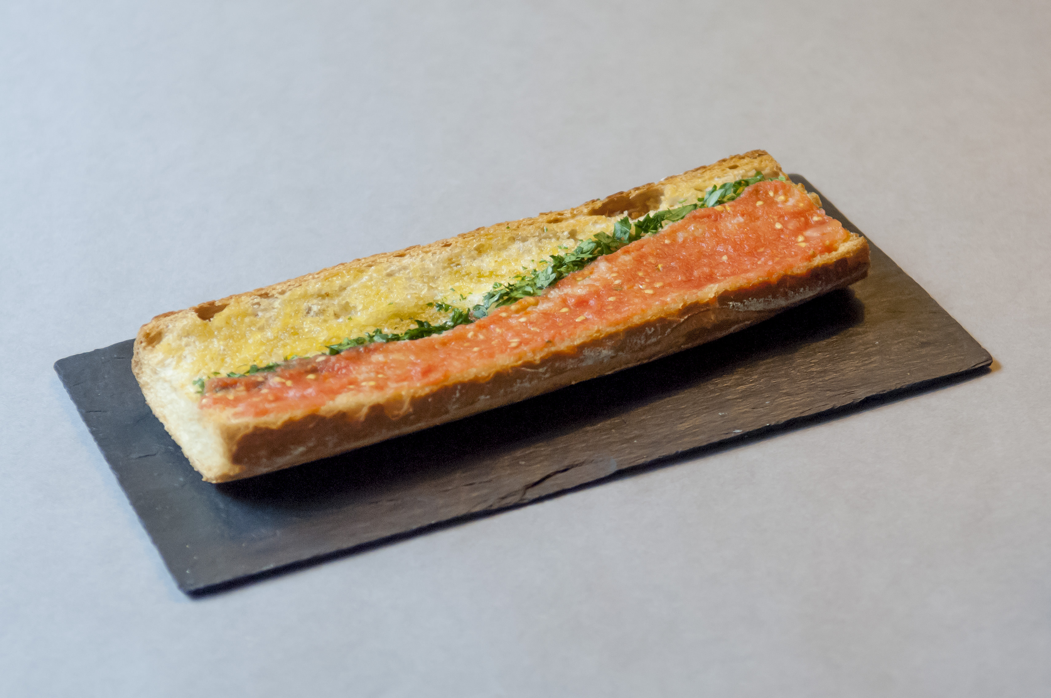
In this era of abundant data, where everything – including our habits and misfortunes – constitutes material to be digitized, measured, and compared, infographics (methods for representing this data) are becoming increasingly important. One specialist in this field, data visualizer Moritz Stefaner has carried out a project in conjunction with Prozessagenten. This is Data Cuisine, initially a research project that has spawned into an itinerant workshop that analyses statistics from its host country. The workshop is divided into two stages: in the first attention is focused on the selection of data to be displayed and the best way to do it, respecting traditions and issues related to the area; in the second phase there is room for practice and, under the guidance of a chef, the creative act is realized, with food used to represent the data being addressed. What ensues is a surprising Data menu, full of colours, flavours and shapes that gives new life to -usually unattractive- statistical analysis. And so, the percentage of men or women who, in Spain, have sex on the first date, is represented by a series of blue or pink noodles, lying solitary or densely interwoven on the plate; while the consumption of alcohol in Finland becomes a map of shots more or less full of beer, wine and spirits that indicate consumption divided by region.
Undoubtedly, a new frontier in communication.
Benedetta
Sabatini